Tempo Labs: AI Design & Coding Tool
How I Built a Scalable Styling Panel That Supports 2 Distinct Workflows
Timeline
Jan - Apr 2024
status
Phased Release
My Role
Product Designer
collaborated w/
PM (CEO) x 1
Engineer (CTO) x 1
Tempo Labs: AI Design & Coding Tool
How I Built a Scalable Styling Panel That Supports 2 Distinct Workflows
Timeline
Jan - Apr 2024
status
Phased Release
My Role
Product Designer
collaborated w/
PM (CEO) x 1
Engineer (CTO) x 1
Tempo Labs: AI Design & Coding Tool
How I Built a Scalable Styling Panel That Supports 2 Distinct Workflows
Timeline
Jan - Apr 2024
status
Phased Release
My Role
Product Designer
collaborated w/
PM (CEO) x 1
Engineer (CTO) x 1
Overview
Tempo Labs is a GenAI tool that turns prompts into UI & code. Once generation is done, users can use the Styling Panel to fine-tune the UI.
The problem
When I joined, there was an investor-facing demo showing the Styling Panel’s functions—and that was all it had.
Since it was built to demonstrate what the system could do but not how real users would actually use it, it was super frustrating to use.
The problem
When I joined, there was an investor-facing demo showing the Styling Panel’s functions—and that was all it had.
Since it was built to demonstrate what the system could do but not how real users would actually use it, it was super frustrating to use.
The problem
When I joined, there was an investor-facing demo showing the Styling Panel’s functions—and that was all it had.
Since it was built to demonstrate what the system could do but not how real users would actually use it, it was super frustrating to use.
My role
I took full ownership and redesigned it from the ground up.
My role
I took full ownership and redesigned it from the ground up.
My role
I took full ownership and redesigned it from the ground up.
🚀
From demo to production-ready
Defined the IA, interaction patterns, and visuals based on usability tests and interviews, turning the demo into a scalable system ready for real users.
🚀
From demo to production-ready
Defined the IA, interaction patterns, and visuals based on usability tests and interviews, turning the demo into a scalable system ready for real users.
🚀
From demo to production-ready
Defined the IA, interaction patterns, and visuals based on usability tests and interviews, turning the demo into a scalable system ready for real users.
🤝
Cross-functional collaboration
Worked closely with engineers and PMs to align design with technical constraints and business priorities and drive design decisions.
🤝
Cross-functional collaboration
Worked closely with engineers and PMs to align design with technical constraints and business priorities and drive design decisions.
🤝
Cross-functional collaboration
Worked closely with engineers and PMs to align design with technical constraints and business priorities and drive design decisions.
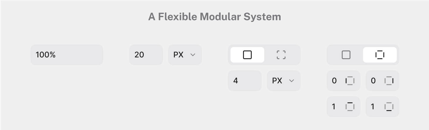
redesign preview & impact
My redesign not only reduced task time by 31% and raising NPS from 2.7 to 8, but also enabled faster implementation through a modular, developer-friendly system.
redesign preview & impact
My redesign not only reduced task time by 31% and raising NPS from 2.7 to 8, but also enabled faster implementation through a modular, developer-friendly system.
redesign preview & impact
My redesign not only reduced task time by 31% and raising NPS from 2.7 to 8, but also enabled faster implementation through a modular, developer-friendly system.
So, how did I get there?
So, how did I get there?
So, how did I get there?
Key Challenges
2 Distinct User Groups × 2 Distinct Workflows
target user groups
The Styling Panel serves 2 very different target user groups:
target user groups
The Styling Panel serves 2 very different target user groups:
target user groups
The Styling Panel serves 2 very different target user groups:
🧑🏻🎨
Designers
visual thinkers, more familiar with design-tool-based styling controls.
🧑🏻🎨
Designers
visual thinkers, more familiar with design-tool-based styling controls.
🧑🏻🎨
Designers
visual thinkers, more familiar with design-tool-based styling controls.
🧑🏻💻
Developer
logic-driven, more familiar with code-based styling workflows and terminology.
🧑🏻💻
Developer
logic-driven, more familiar with code-based styling workflows and terminology.
🧑🏻💻
Developer
logic-driven, more familiar with code-based styling workflows and terminology.
a unique styling panel
Meanwhile, unlike other typical styling panels, it reflects one of the product’s key differentiators: Tailwind CSS integration.
In other words, it allows users to style elements in two ways:
a unique styling panel
Meanwhile, unlike other typical styling panels, it reflects one of the product’s key differentiators: Tailwind CSS integration.
In other words, it allows users to style elements in two ways:
a unique styling panel
Meanwhile, unlike other typical styling panels, it reflects one of the product’s key differentiators: Tailwind CSS integration.
In other words, it allows users to style elements in two ways:
🎨
Precisely adjust visual properties using controls
🎨
Precisely adjust visual properties using controls
🎨
Precisely adjust visual properties using controls
💻
Quickly apply predefined Tailwind CSS classes
💻
Quickly apply predefined Tailwind CSS classes
💻
Quickly apply predefined Tailwind CSS classes
Design Goals
Clarity—Create an inclusive Styling Panel that serves both user groups with equal clarity, despite their fundamentally different mindsets and workflows
Flexibility—Seamlessly integrate Tailwind CSS into the Styling Panel without overwhelming users with technical complexity or limiting editing flexibility
Design for Clarity
Lay the Foundation First
step #1
I started with restructuring the information architecture through close collaboration with stakeholders.
I audited existing and planned controls and grouped them into logical sections and prioritized them based on frequency and importance.
step #1
I started with restructuring the information architecture through close collaboration with stakeholders.
I audited existing and planned controls and grouped them into logical sections and prioritized them based on frequency and importance.
step #1
I started with restructuring the information architecture through close collaboration with stakeholders.
I audited existing and planned controls and grouped them into logical sections and prioritized them based on frequency and importance.
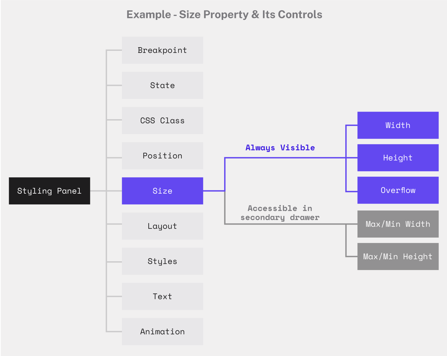
step #2
Then I summarized all involved input types and designed a modular input system that could adapt to various formats.
step #2
Then I summarized all involved input types and designed a modular input system that could adapt to various formats.
step #2
Then I summarized all involved input types and designed a modular input system that could adapt to various formats.
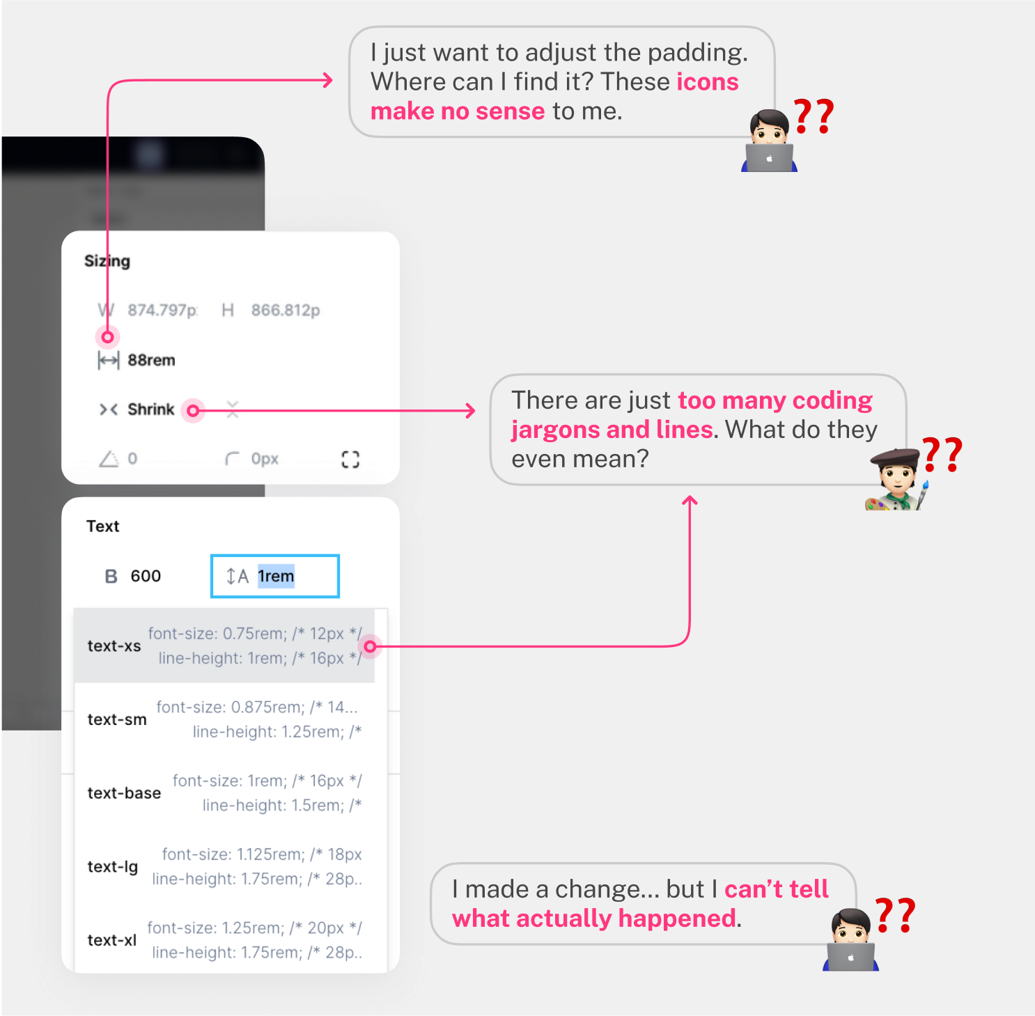
Find the Root Cause
Bridge Gaps in Understanding Across 2 Distinct User Types
user pain points
Through in-depth user interviews on the demo, I identified 3 key issues:
user pain points
Through in-depth user interviews on the demo, I identified 3 key issues:
user pain points
Through in-depth user interviews on the demo, I identified 3 key issues:
My Design Response
Correspondingly, I addressed each of them through targeted, detail-oriented design solutions:
My Design Response
Correspondingly, I addressed each of them through targeted, detail-oriented design solutions:
My Design Response
Correspondingly, I addressed each of them through targeted, detail-oriented design solutions:

Design for Flexibility
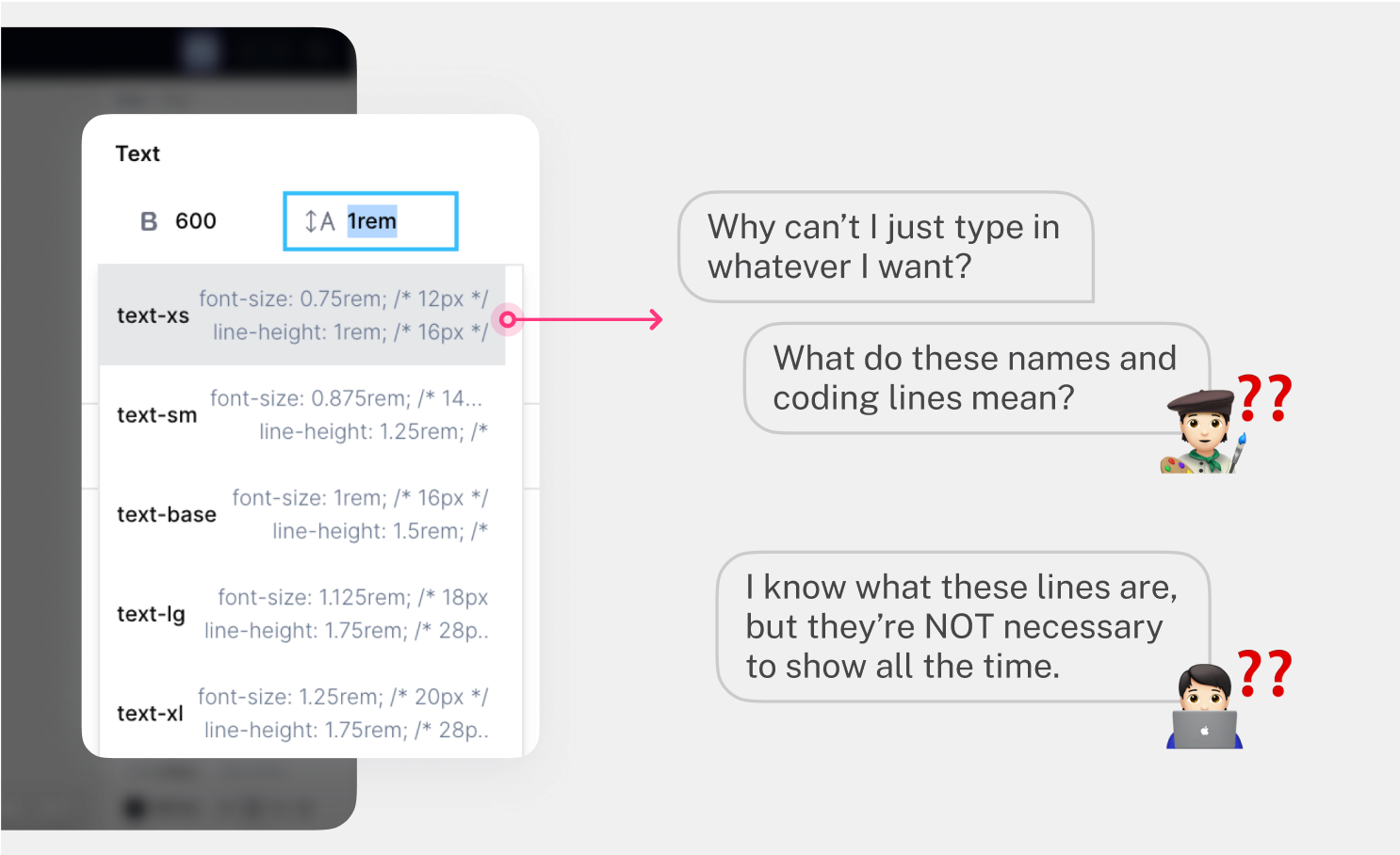
My Initial Approach: make Tailwind CSS class editing just another way to adjust style
user pain point
In the demo, the class options were mixed into the styling dropdown, which was super confusing for both user groups.
user pain point
In the demo, the class options were mixed into the styling dropdown, which was super confusing for both user groups.
user pain point
In the demo, the class options were mixed into the styling dropdown, which was super confusing for both user groups.
my design response
To reduce cognitive load and increase flexibility, I made class editing a parallel input method alongside other properties.
my design response
To reduce cognitive load and increase flexibility, I made class editing a parallel input method alongside other properties.
my design response
To reduce cognitive load and increase flexibility, I made class editing a parallel input method alongside other properties.
Find the Root Cause
Feedback from User Testing + Weekly Stakeholder Meeting
feedback from users & stakeholders
Too separate, too rigid.
Users and stakeholders both pointed out that the class editing area was disconnected from where styling decisions were actually being made.
feedback from users & stakeholders
Too separate, too rigid.
Users and stakeholders both pointed out that the class editing area was disconnected from where styling decisions were actually being made.
feedback from users & stakeholders
Too separate, too rigid.
Users and stakeholders both pointed out that the class editing area was disconnected from where styling decisions were actually being made.

Find the Root Cause
New Direction: make Tailwind CSS class editing contextual and on demand
my design response
Instead of putting CSS class as a separate property section, I integrated them inline with each relevant styling control.
my design response
Instead of putting CSS class as a separate property section, I integrated them inline with each relevant styling control.
my design response
Instead of putting CSS class as a separate property section, I integrated them inline with each relevant styling control.
Find the Root Cause
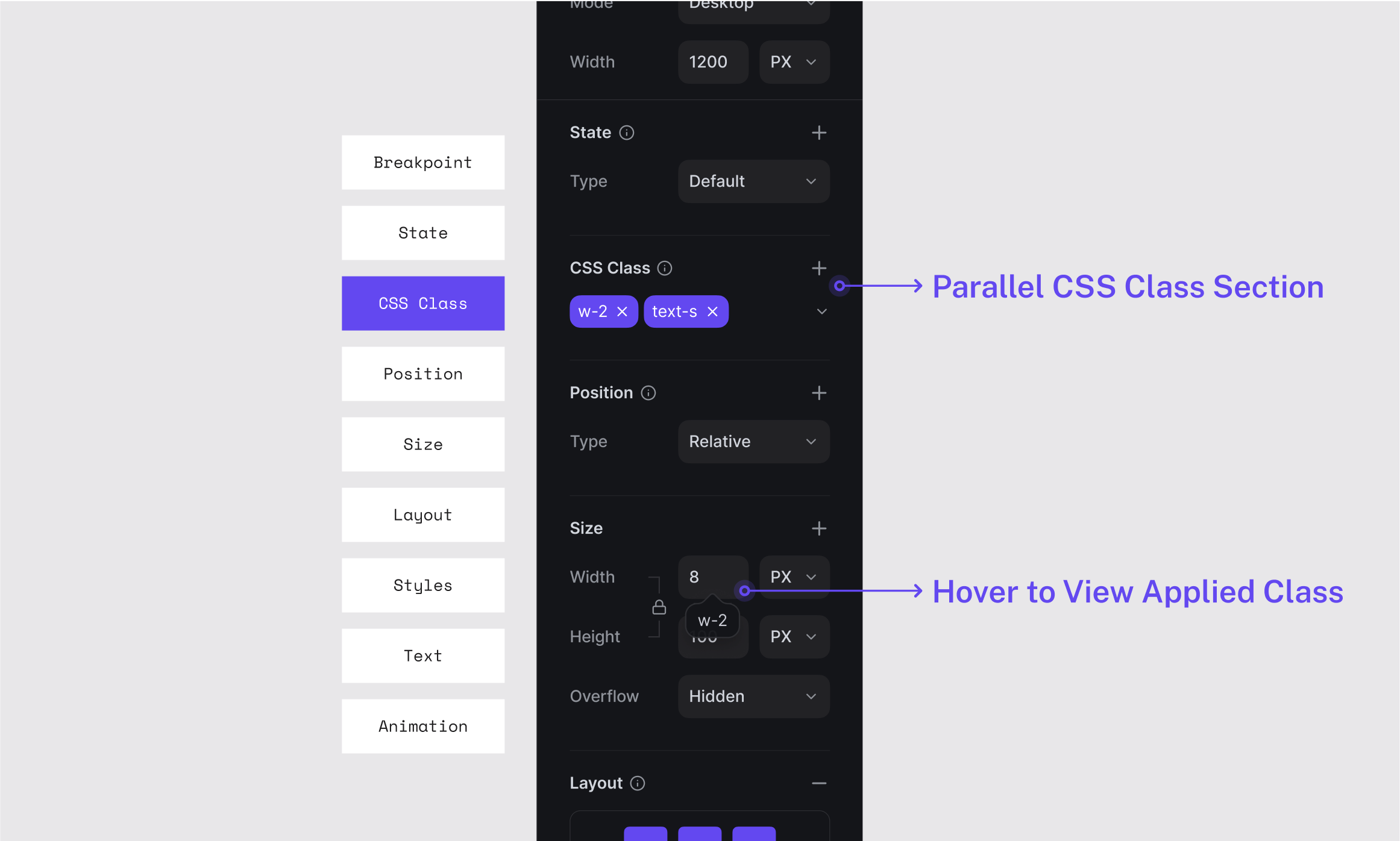
Final Touch: Retain the centralized Tailwind CSS class overview
feedback from users & stakeholders
After making it inline, some users, especially developers, wanted a way to see all applied classes in one place.
feedback from users & stakeholders
After making it inline, some users, especially developers, wanted a way to see all applied classes in one place.
feedback from users & stakeholders
After making it inline, some users, especially developers, wanted a way to see all applied classes in one place.
my design response
I retained the original class section and repositioned it as an overview with light editing capabilities.
my design response
I retained the original class section and repositioned it as an overview with light editing capabilities.
my design response
I retained the original class section and repositioned it as an overview with light editing capabilities.
Final Design
Design Highlights
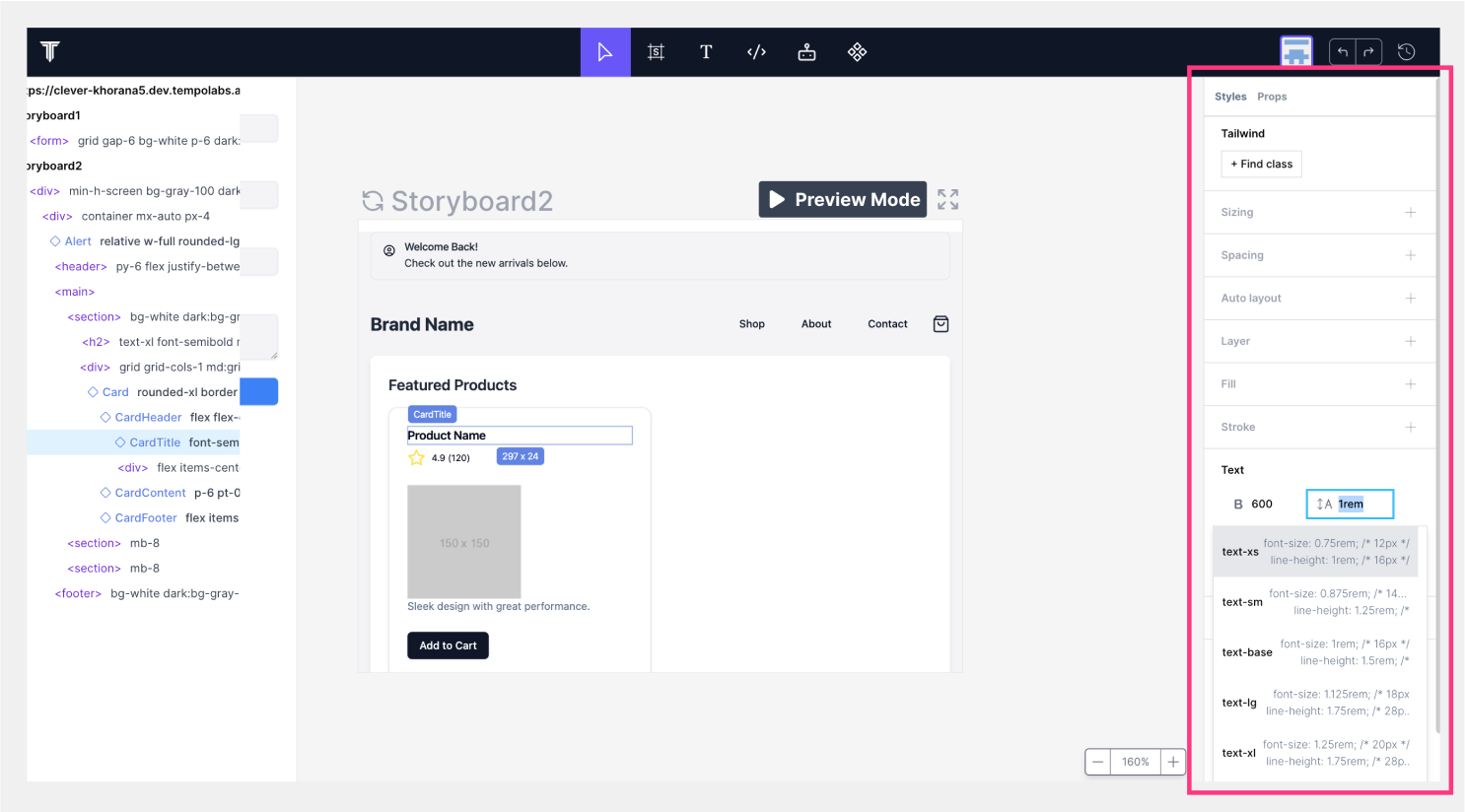
Highlight #1
From helpful tooltips, clear labels to live previews, the new styling panel is intuitive for both designers and developers.
Highlight #1
From helpful tooltips, clear labels to live previews, the new styling panel is intuitive for both designers and developers.
Highlight #1
From helpful tooltips, clear labels to live previews, the new styling panel is intuitive for both designers and developers.
Find the Root Cause
Highlight #2
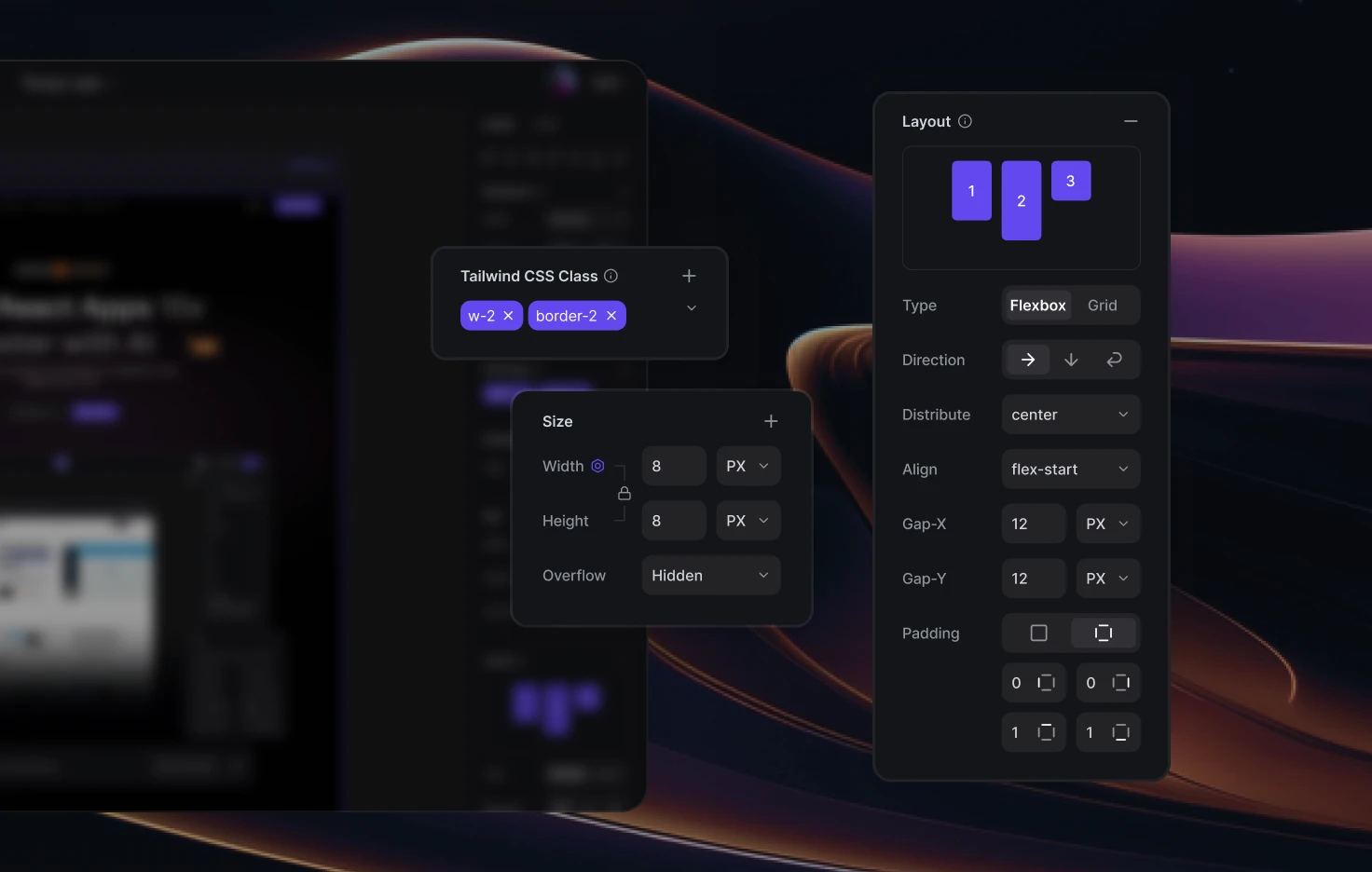
Tailwind CSS class editing now feels seamless in context, while still giving you a central place to manage all classes.
Highlight #2
Tailwind CSS class editing now feels seamless in context, while still giving you a central place to manage all classes.
Highlight #2
Tailwind CSS class editing now feels seamless in context, while still giving you a central place to manage all classes.
Find the Root Cause
Other Features
Other Feature #1
Secondary controls stay out of the way until you choose to expand them, keeping the interface clean and focused.
Other Feature #1
Secondary controls stay out of the way until you choose to expand them, keeping the interface clean and focused.
Other Feature #1
Secondary controls stay out of the way until you choose to expand them, keeping the interface clean and focused.
Find the Root Cause
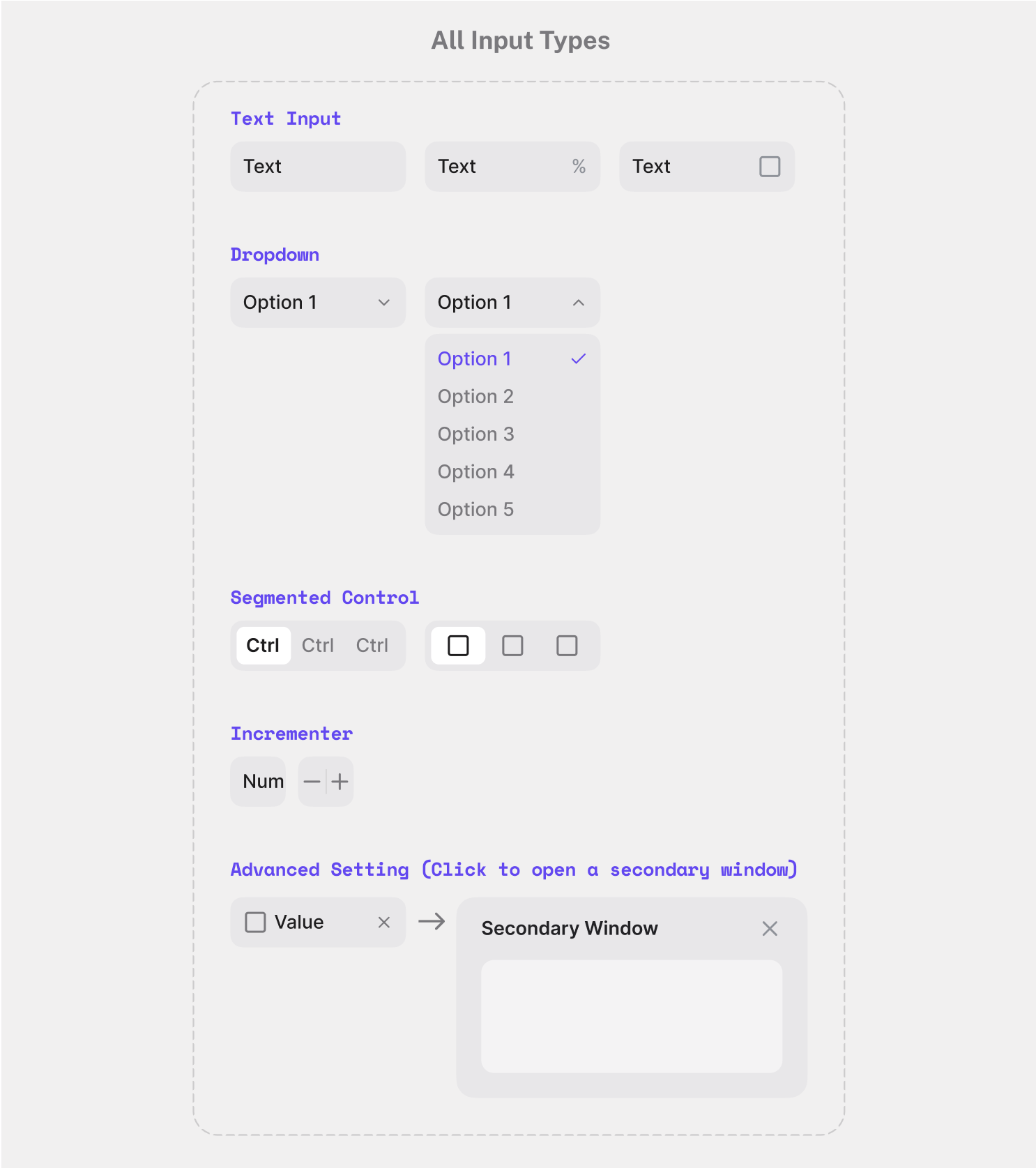
Other Feature #2
Adjust advanced settings in a separate window only when you need them, and never in your way.
Other Feature #2
Adjust advanced settings in a separate window only when you need them, and never in your way.
Other Feature #2
Adjust advanced settings in a separate window only when you need them, and never in your way.
Final Outcome
31.1%
31.1%
31.1%
The average Time on Task for all related flows was reduced by 31.1%
8.2
8.2
8.2
/10
/10
/10
The average Net Promoter Score (NPS) increased from 2.7 to 8.2
“I love that the interface stays clean, but I can still go deeper if I need to.”
Feedback from User Testing
Takeaways
Takeaway #1
❤️🩹 Clarity Comes from Empathy
Clear structure is important—but real clarity comes from anticipating how users interpret, act, and make decisions. Small design details played a big role in building that confidence.
Takeaway #1
❤️🩹 Clarity Comes from Empathy
Clear structure is important—but real clarity comes from anticipating how users interpret, act, and make decisions. Small design details played a big role in building that confidence.
Takeaway #1
❤️🩹 Clarity Comes from Empathy
Clear structure is important—but real clarity comes from anticipating how users interpret, act, and make decisions. Small design details played a big role in building that confidence.
Takeaway #2
🧩 Scalability Starts with Systematic Thinking
A modular design system not only created a more flexible user experience, but also enabled faster implementation for developers—saving time while future-proofing the product.
Takeaway #2
🧩 Scalability Starts with Systematic Thinking
A modular design system not only created a more flexible user experience, but also enabled faster implementation for developers—saving time while future-proofing the product.
Takeaway #2
🧩 Scalability Starts with Systematic Thinking
A modular design system not only created a more flexible user experience, but also enabled faster implementation for developers—saving time while future-proofing the product.