Ditto: AI Agent for Dating
How I 4x’d the Conversion Rate with a 2-Hour Design Fix
Timeline
Feb 2025
status
Implemented
My Role
Product Designer
collaborated w/
Product Design Lead
Dev Team
Ditto: AI Agent for Dating
How I 4x’d the Conversion Rate with a 2-Hour Design Fix
Timeline
Feb 2025
status
Implemented
My Role
Product Designer
collaborated w/
Product Design Lead
Dev Team
Ditto: AI Agent for Dating
How I 4x’d the Conversion Rate with a 2-Hour Design Fix
Timeline
Feb 2025
status
Implemented
My Role
Product Designer
collaborated w/
Product Design Lead
Dev Team
Context
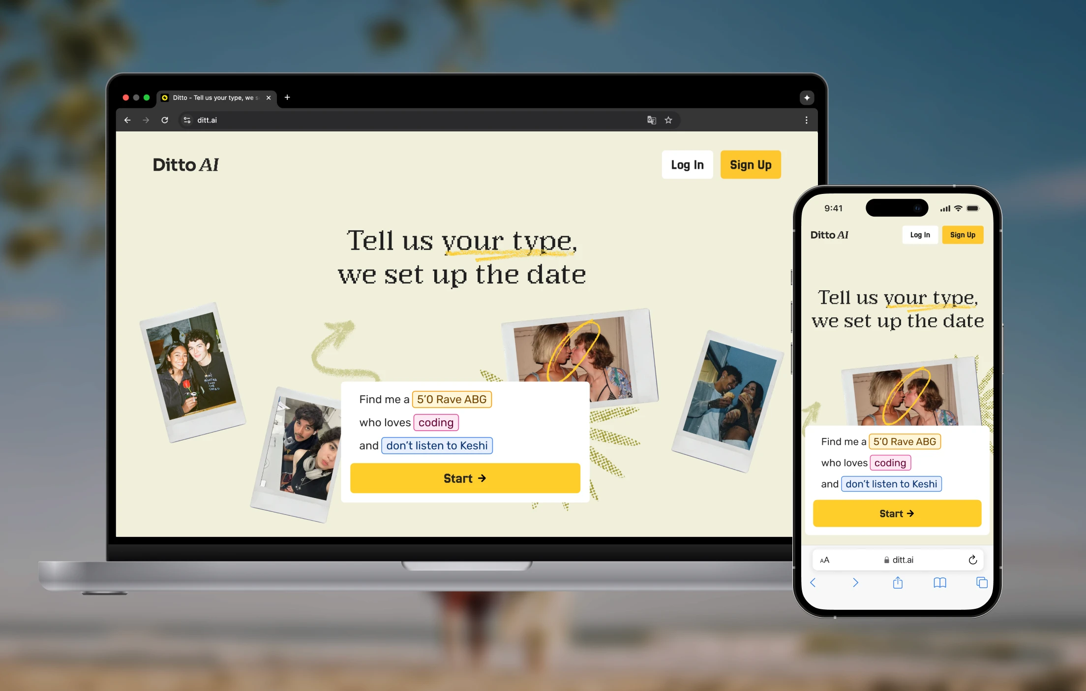
Ditto AI is a Google-backed startup helping college students connect through AI-powered dating.
key user flow
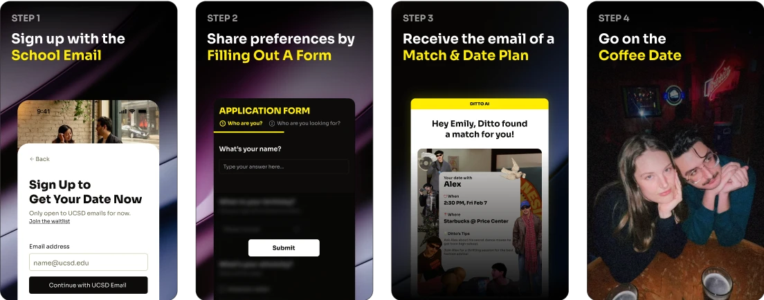
The user flow is simple:
key user flow
The user flow is simple:
key user flow
The user flow is simple:
My role
As it’s an early-stage startup, I’m responsible for:
My role
As it’s an early-stage startup, I’m responsible for:
My role
As it’s an early-stage startup, I’m responsible for:
🎨
End-to-end product design
User research, IA, user flow, wireframe, prototyping, iteration, final implementation
🎨
End-to-end product design
User research, IA, user flow, wireframe, prototyping, iteration, final implementation
🎨
End-to-end product design
User research, IA, user flow, wireframe, prototyping, iteration, final implementation
📈
Data analysis
Identify potential problems, inform product decisions, improve important metrics
📈
Data analysis
Identify potential problems, inform product decisions, improve important metrics
📈
Data analysis
Identify potential problems, inform product decisions, improve important metrics
Problem
Only a few users submitted the form
in the first 3 days of the UCSD soft launch.
Find Root Causes
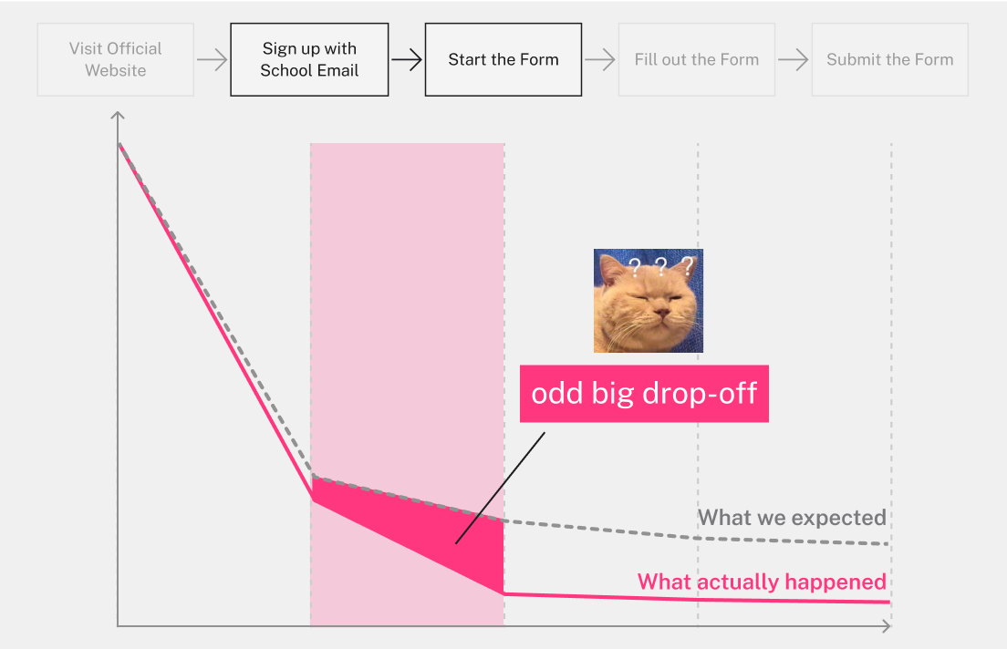
STEP 1: I began by pinpointing the drop-off point.
data analysis finding
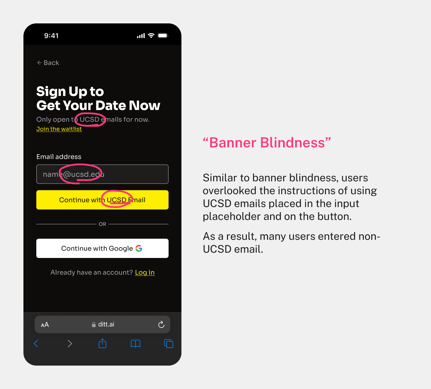
Using the event tracking tool, I noticed a big odd drop-off between inputting email and starting the form.
data analysis finding
Using the event tracking tool, I noticed a big odd drop-off between inputting email and starting the form.
data analysis finding
Using the event tracking tool, I noticed a big odd drop-off between inputting email and starting the form.
It was so strange because...
Users already overcame the biggest psychological barrier to signing up.
Why would they abandon immediately?
Users already overcame the biggest psychological barrier to signing up.
Why would they abandon immediately?
Users already overcame the biggest psychological barrier to signing up.
Why would they abandon immediately?
Find the Root Cause
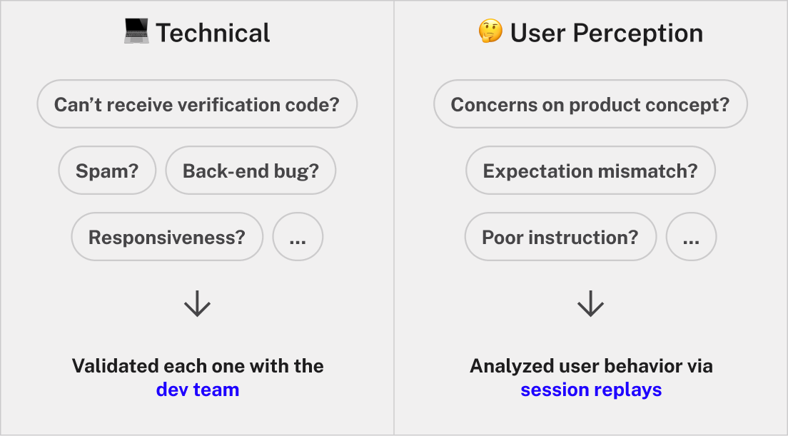
STEP 2: Then I listed and validated all possible cases.
Finally, I found out that the reason is...
Even with multiple visual cues in place,
users consistently missed the requirement to use school emails.
Even with multiple visual cues in place,
users consistently missed the requirement to use school emails.
Even with multiple visual cues in place,
users consistently missed the requirement to use school emails.
Find the Root Cause
STEP 3: I analyzed the root causes.
Root cause
There’re 2 Root Causes:
Root cause
There’re 2 Root Causes:
Root cause
There’re 2 Root Causes:
Finally, I walked the product design lead through this issue.
With alignment, I immediately proceeded to design and deploy the fix.
Finally, I walked the product design lead through this issue.
With alignment, I immediately proceeded to design and deploy the fix.
Finally, I walked the product design lead through this issue.
With alignment, I immediately proceeded to design and deploy the fix.
My Quick Solution
Design Consideration
At this early stage, Ditto AI was in a soft launch and UCSD-only. So, I aimed for a fix that was:
Design Consideration
At this early stage, Ditto AI was in a soft launch and UCSD-only. So, I aimed for a fix that was:
Design Consideration
At this early stage, Ditto AI was in a soft launch and UCSD-only. So, I aimed for a fix that was:

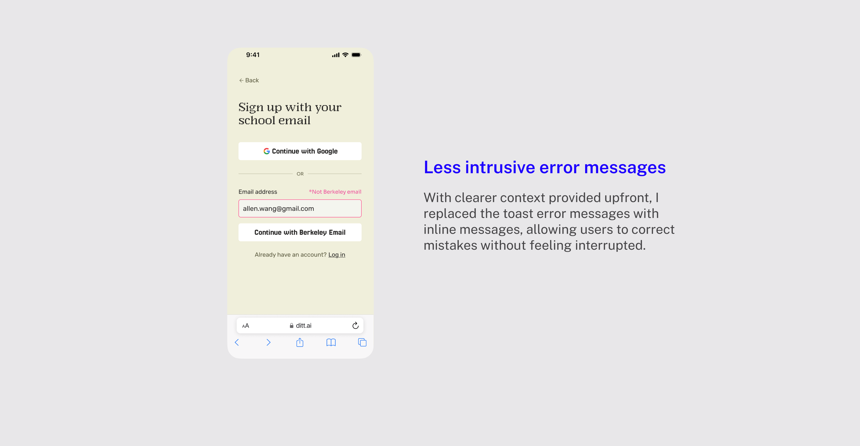
Final design
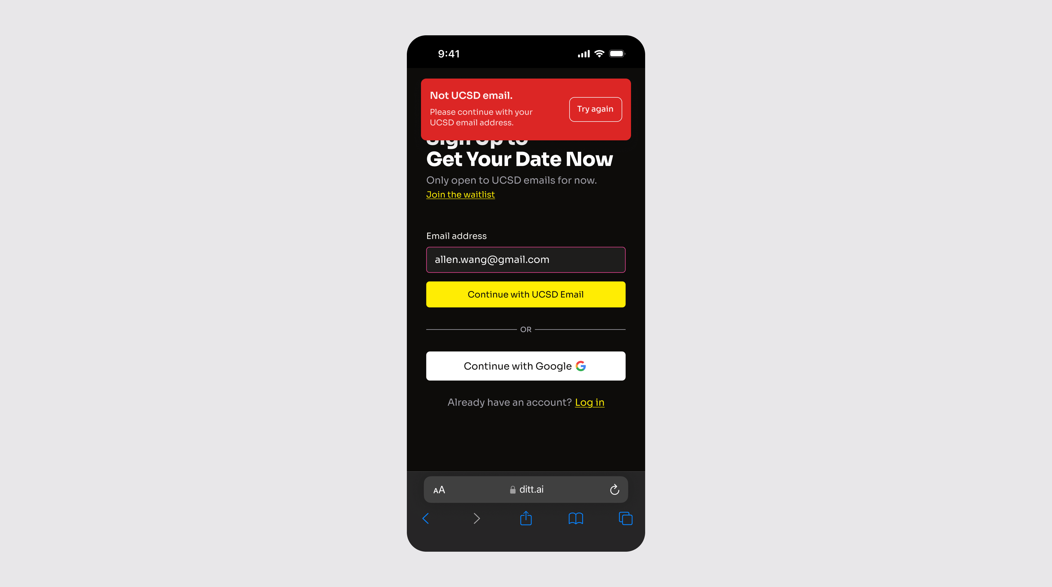
I removed the waitlist pop-up and replaced it with an eye-catching error toast using ShadCN components.
Final design
I removed the waitlist pop-up and replaced it with an eye-catching error toast using ShadCN components.
Final design
I removed the waitlist pop-up and replaced it with an eye-catching error toast using ShadCN components.
Then I worked closely with the dev team to quickly deliver the fix. From identifying the issue to deploying the fix, the entire process just took less than 2 hours.
Then I worked closely with the dev team to quickly deliver the fix. From identifying the issue to deploying the fix, the entire process just took less than 2 hours.
Then I worked closely with the dev team to quickly deliver the fix. From identifying the issue to deploying the fix, the entire process just took less than 2 hours.
Final Outcome
conversion metrics
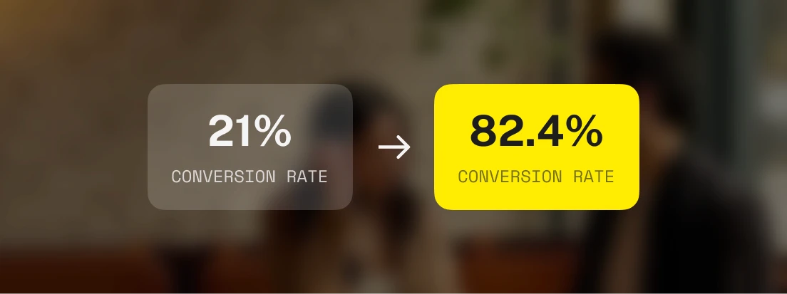
The new design increased the conversion rate from email input to form start by 4x.
conversion metrics
The new design increased the conversion rate from email input to form start by 4x.
conversion metrics
The new design increased the conversion rate from email input to form start by 4x.
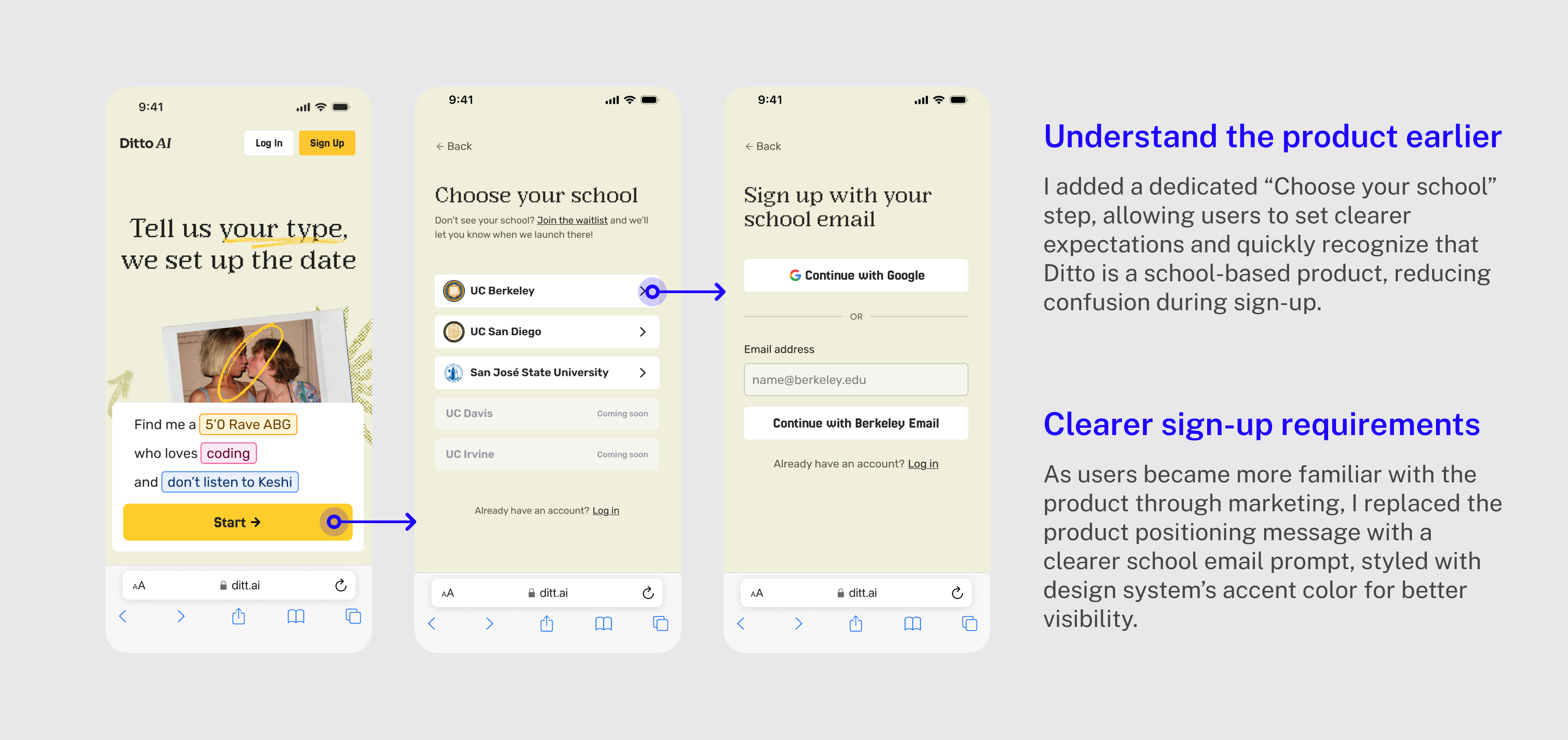
Revisit the Flow
As we expanded to UC Berkeley, SJSU, and other schools, I took the initiative to evolve our onboarding flow beyond the original quick fix.
newest onboarding flow
A clearer, school-specific onboarding flow that helped users feel more informed and less likely to drop off. Here’s how:
newest onboarding flow
A clearer, school-specific onboarding flow that helped users feel more informed and less likely to drop off. Here’s how:
newest onboarding flow
A clearer, school-specific onboarding flow that helped users feel more informed and less likely to drop off. Here’s how:
Takeaways
Takeaway #1
⚡ Rapid Response Matters
Catching the issue and shipping a fix rapidly taught me how powerful quick action can be—especially when the product is still evolving. Sometimes speed really does make all the difference.
Takeaway #1
⚡ Rapid Response Matters
Catching the issue and shipping a fix rapidly taught me how powerful quick action can be—especially when the product is still evolving. Sometimes speed really does make all the difference.
Takeaway #1
⚡ Rapid Response Matters
Catching the issue and shipping a fix rapidly taught me how powerful quick action can be—especially when the product is still evolving. Sometimes speed really does make all the difference.
Takeaway #2
📊 Data + Observation = Insight
Numbers can tell you where a problem exists, but direct observation shows you why. I've strengthened my practice of combining quantitative analysis with qualitative investigation to fully understand user behavior.
Takeaway #2
📊 Data + Observation = Insight
Numbers can tell you where a problem exists, but direct observation shows you why. I've strengthened my practice of combining quantitative analysis with qualitative investigation to fully understand user behavior.
Takeaway #2
📊 Data + Observation = Insight
Numbers can tell you where a problem exists, but direct observation shows you why. I've strengthened my practice of combining quantitative analysis with qualitative investigation to fully understand user behavior.
Takeaway #3
🎯 Design Should Match the Moment
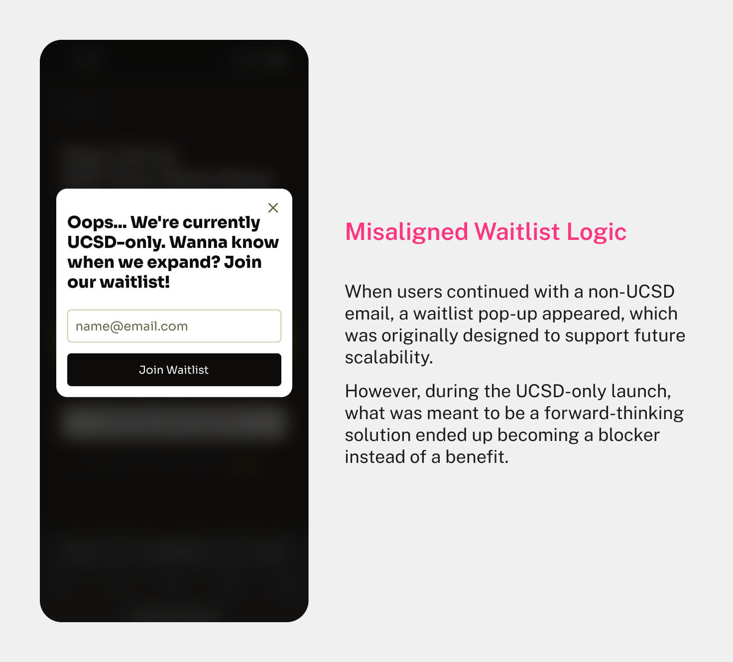
The waitlist flow made perfect sense for future growth. But during this launch, it ended up getting in the way. This reminded me that even “good” design can be mistimed. A solution that’s right for the future isn’t always right for right now—and knowing when to scale back is just as important as planning ahead.
Takeaway #3
🎯 Design Should Match the Moment
The waitlist flow made perfect sense for future growth. But during this launch, it ended up getting in the way. This reminded me that even “good” design can be mistimed. A solution that’s right for the future isn’t always right for right now—and knowing when to scale back is just as important as planning ahead.