IM Motors: After-Sales Service App
How I Helped Auto Mechanics Work 14.8% Faster and Feel 26.3% Happier
status
Launched in 2022
My Role
UX Designer
team
Design Director x 1
Project Manager x 1
Visual Designer x 1
client's XFN team
UX Department Lead x 1
Engineers x 3
Product Manager x 2
Operation Director x 1
Overview
IM Motors is a high-end e-vehicle brand in China, differentiating itself through top-tier on-site after-sales service carried out by auto mechanics.
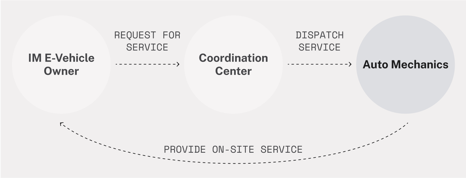
After-Sales Service Process
To support this experience, IM Motors provides an app for auto mechanics to manage and deliver on-site services.
After-Sales Service Process
To support this experience, IM Motors provides an app for auto mechanics to manage and deliver on-site services.
After-Sales Service Process
To support this experience, IM Motors provides an app for auto mechanics to manage and deliver on-site services.
the problem
However, while the app looked refined, it was hard to use, leading to slower workflows and inconsistent service quality.
the problem
However, while the app looked refined, it was hard to use, leading to slower workflows and inconsistent service quality.
the problem
However, while the app looked refined, it was hard to use, leading to slower workflows and inconsistent service quality.
My design solutions
I worked closely with stakeholders to implement a wide range of design changes, enabling users to work 14.8% faster and feel 26.3% more satisfied.
In this case study, I’ll use these 3 features as examples to show how I tackled the key user problems, while balancing all constraints.
So, how did I get there?
So, how did I get there?
So, how did I get there?
3-Week Sprint
Since we only had 3 weeks, we decided to run 3 sprints that aim for quick ideation & validation.
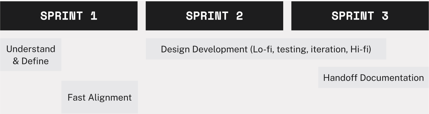
Understand & Define
Challenge: No direct access to real users
my approach
I self-studied and asked for help from experienced seniors to identify alternative research methods.
Finally, I conducted 2 types of research:
my approach
I self-studied and asked for help from experienced seniors to identify alternative research methods.
Finally, I conducted 2 types of research:
my approach
I self-studied and asked for help from experienced seniors to identify alternative research methods.
Finally, I conducted 2 types of research:
👥
User Proxy Interview
Who they are? What they do?
👥
User Proxy Interview
Who they are? What they do?
👥
User Proxy Interview
Who they are? What they do?
🎭
Role-playing Workshop
How do they feel during work?
🎭
Role-playing Workshop
How do they feel during work?
🎭
Role-playing Workshop
How do they feel during work?
result
Based on the research, I gradually learned how my target users look like:
result
Based on the research, I gradually learned how my target users look like:
result
Based on the research, I gradually learned how my target users look like:
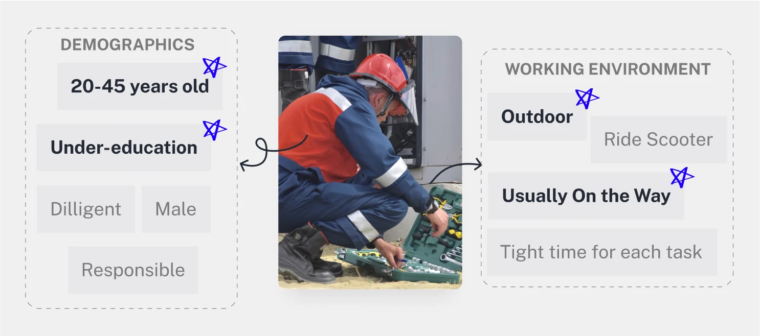
When working outdoors, users faced 3 key problems that hindered their efficiency:
problem #1
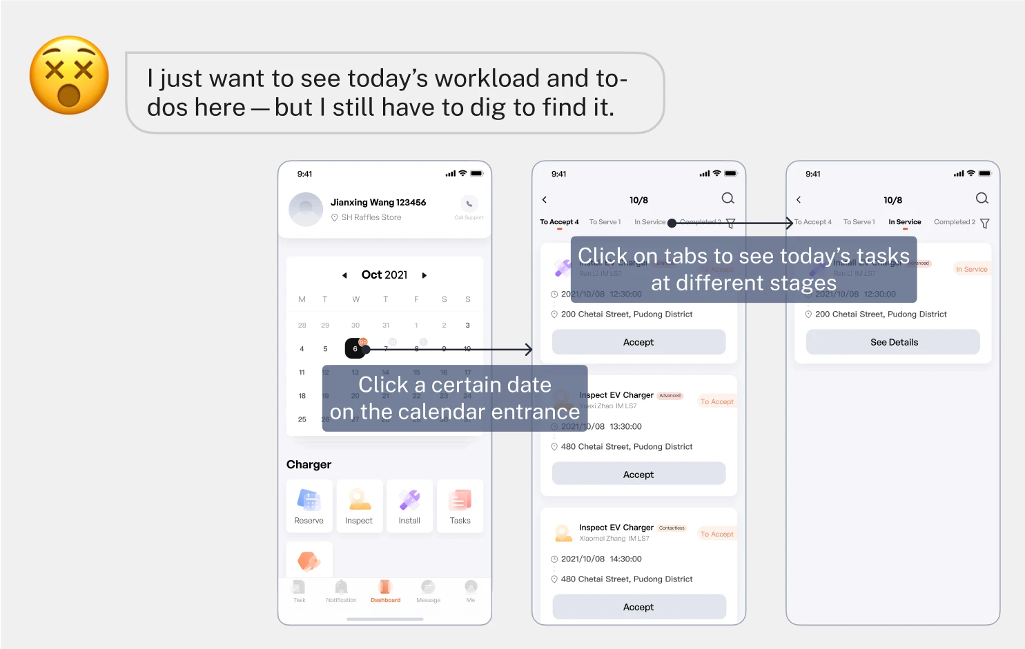
Can’t get a clear overview of their daily workload and to-dos.
problem #1
Can’t get a clear overview of their daily workload and to-dos.
problem #1
Can’t get a clear overview of their daily workload and to-dos.
problem #2
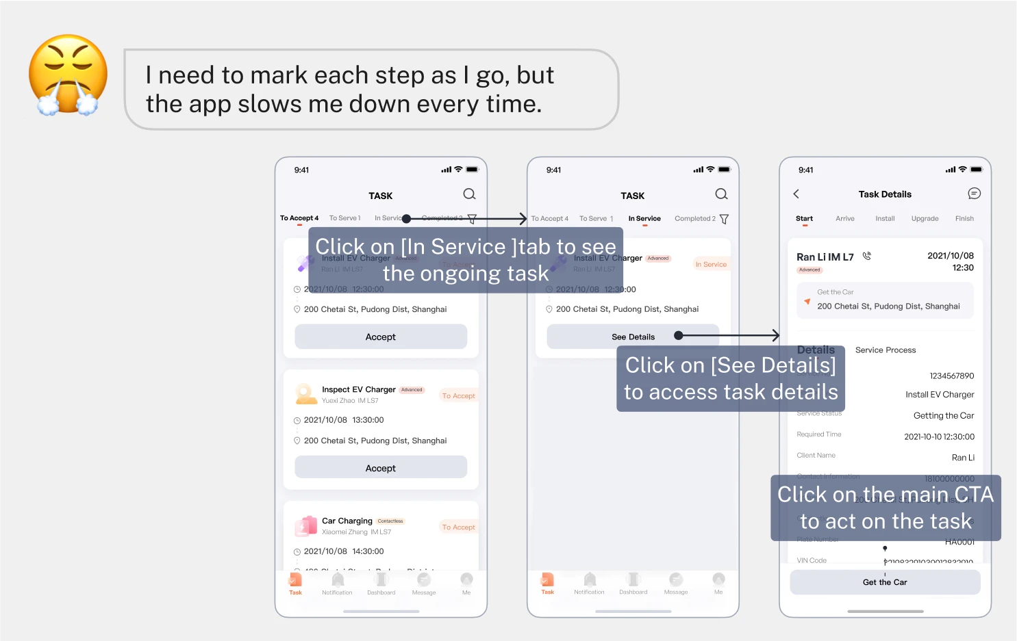
Can’t quickly return to ongoing tasks to record their progress.
problem #2
Can’t quickly return to ongoing tasks to record their progress.
problem #2
Can’t quickly return to ongoing tasks to record their progress.
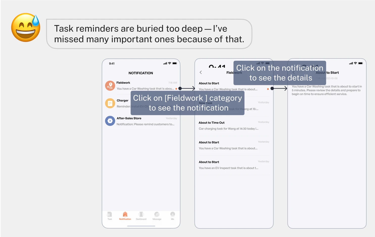
problem #3
Can’t easily spot time-sensitive task reminders.
problem #3
Can’t easily spot time-sensitive task reminders.
problem #3
Can’t easily spot time-sensitive task reminders.
Root cause
After conducting a thorough UX audit and synthesis, I identified 2 root causes:
Root cause
After conducting a thorough UX audit and synthesis, I identified 2 root causes:
Root cause
After conducting a thorough UX audit and synthesis, I identified 2 root causes:
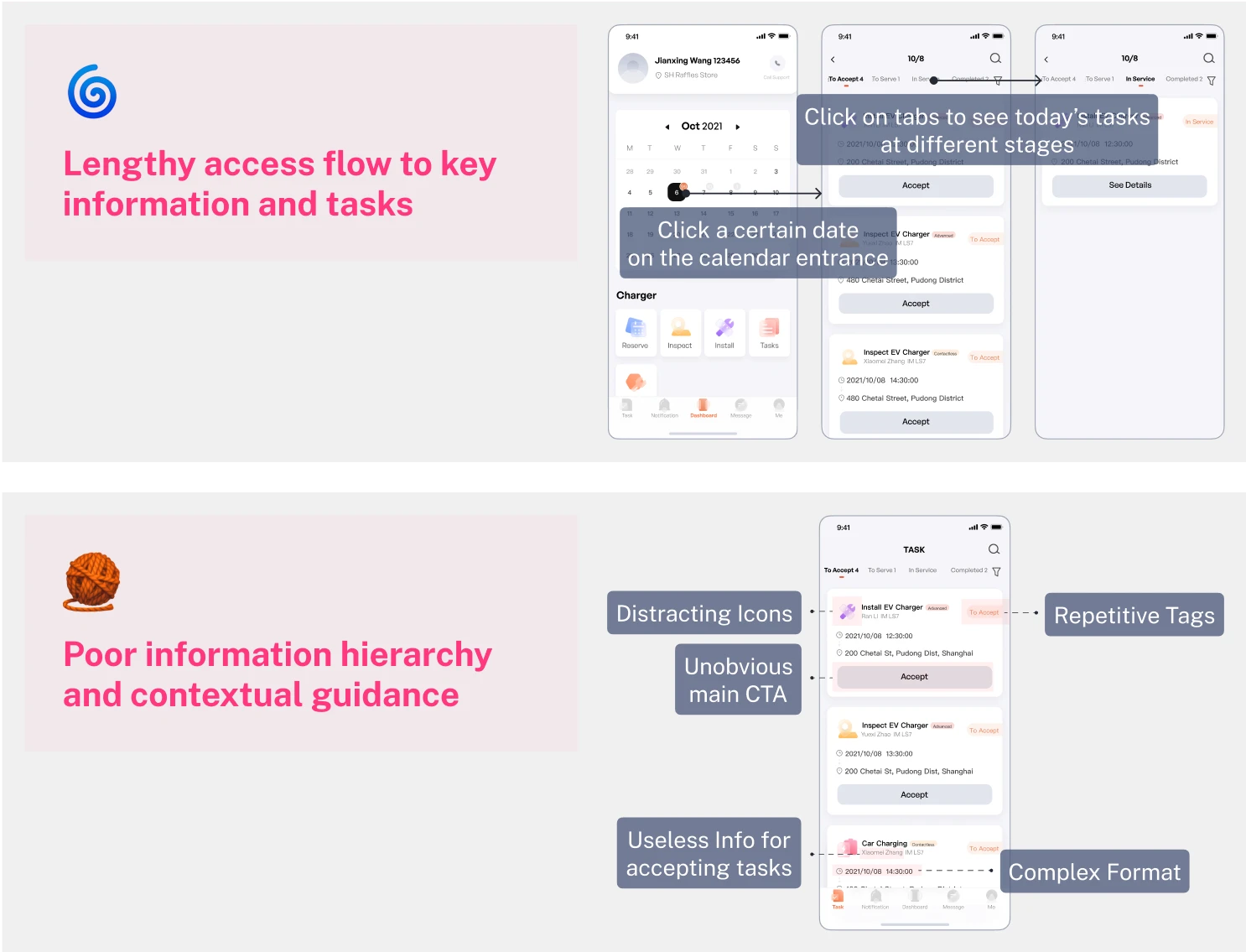
🌀
Lengthy access flow to key info & tasks
Even though there’s available space, users still have to navigate through several pages to access essential information.
🌀
Lengthy access flow to key info & tasks
Even though there’s available space, users still have to navigate through several pages to access essential information.
🌀
Lengthy access flow to key info & tasks
Even though there’s available space, users still have to navigate through several pages to access essential information.
🧶
Poor information hierarchy & guidance
Excessive UI elements and poor information hierarchy make it difficult to identify and complete their next step efficiently.
🧶
Poor information hierarchy & guidance
Excessive UI elements and poor information hierarchy make it difficult to identify and complete their next step efficiently.
🧶
Poor information hierarchy & guidance
Excessive UI elements and poor information hierarchy make it difficult to identify and complete their next step efficiently.
Design Strategy
Surface crucial actions & information in simplified, scenario-specific formats to streamline user flows & improve efficiency.
Surface crucial actions & information in simplified, scenario-specific formats to streamline user flows & improve efficiency.
Surface crucial actions & information in simplified, scenario-specific formats to streamline user flows & improve efficiency.
Fast Alignment
Challenge: Lack of clarity from the client on scope and technical support
my approach
I quickly created an ideal concept targeting all problems as a starting point to accelerate alignment with all stakeholders.
my approach
I quickly created an ideal concept targeting all problems as a starting point to accelerate alignment with all stakeholders.
my approach
I quickly created an ideal concept targeting all problems as a starting point to accelerate alignment with all stakeholders.
Final Scope
Develop each feature individually without revamping the overall IA to ensure the final solutions are both impactful and feasible.
Develop each feature individually without revamping the overall IA to ensure the final solutions are both impactful and feasible.
Develop each feature individually without revamping the overall IA to ensure the final solutions are both impactful and feasible.
Design Development
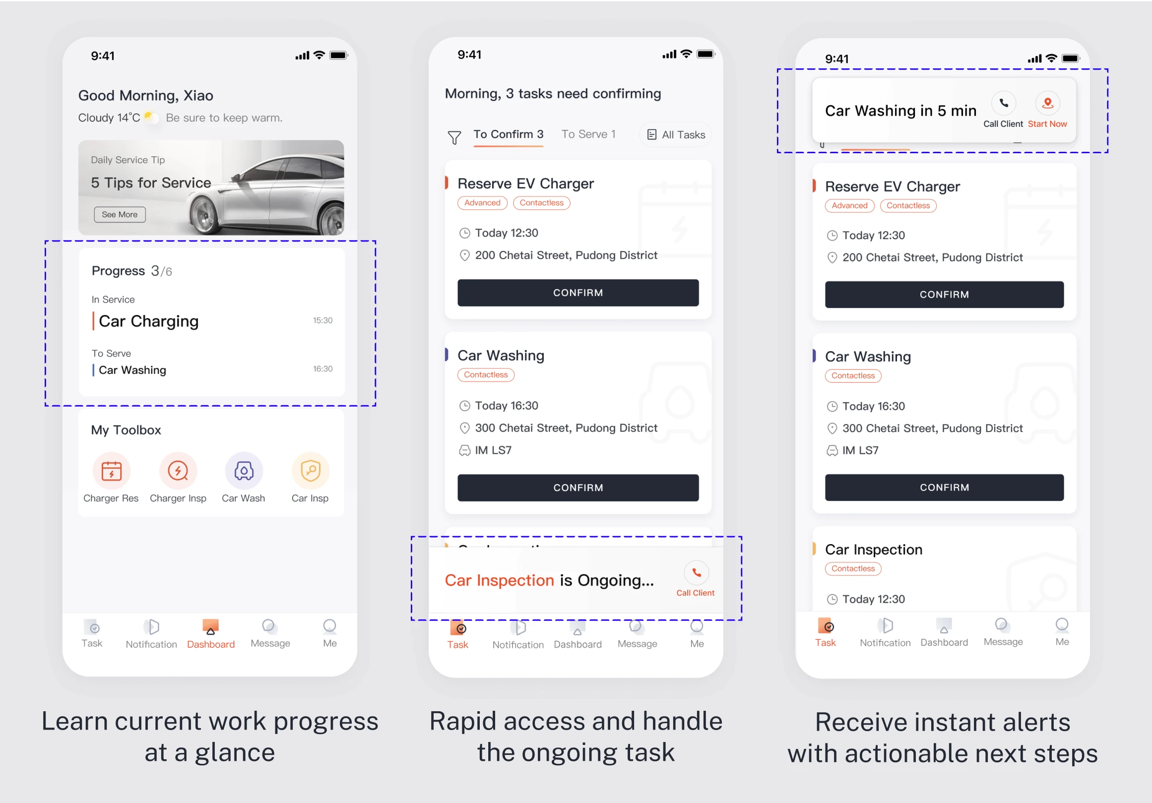
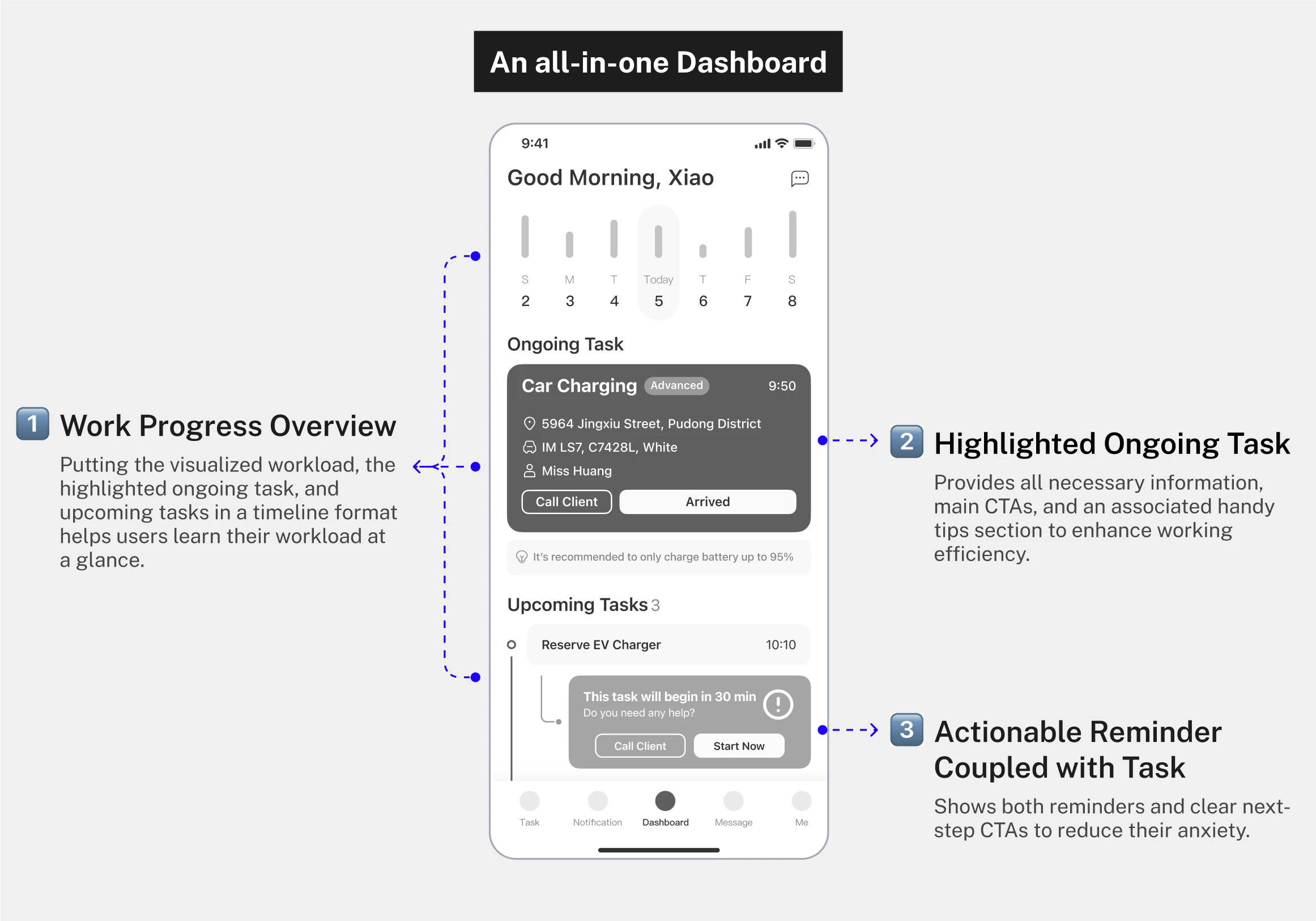
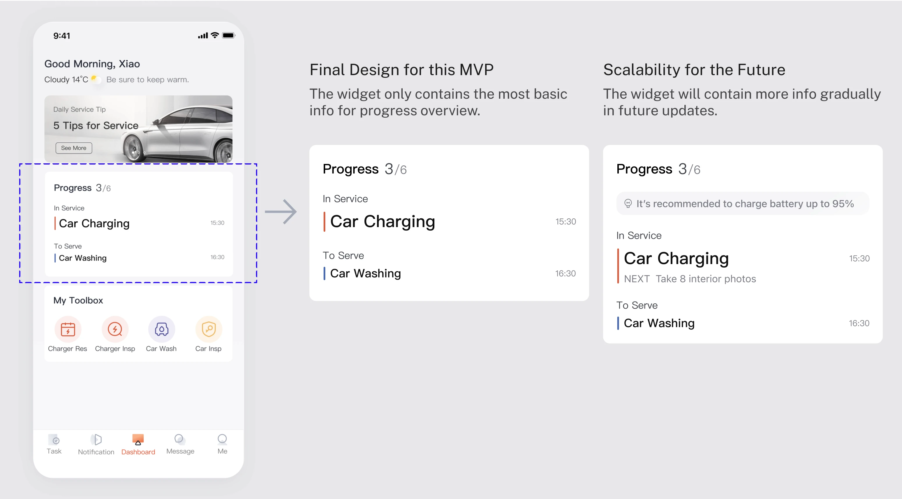
Feature #1: Daily Work Progress Widget
Initial feedback
Great idea—but a simple overview is enough for the MVP
Initial feedback
Great idea—but a simple overview is enough for the MVP
Initial feedback
Great idea—but a simple overview is enough for the MVP
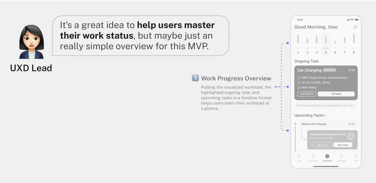
my approach
I first translated the feedback into a clear design direction.
my approach
I first translated the feedback into a clear design direction.
my approach
I first translated the feedback into a clear design direction.
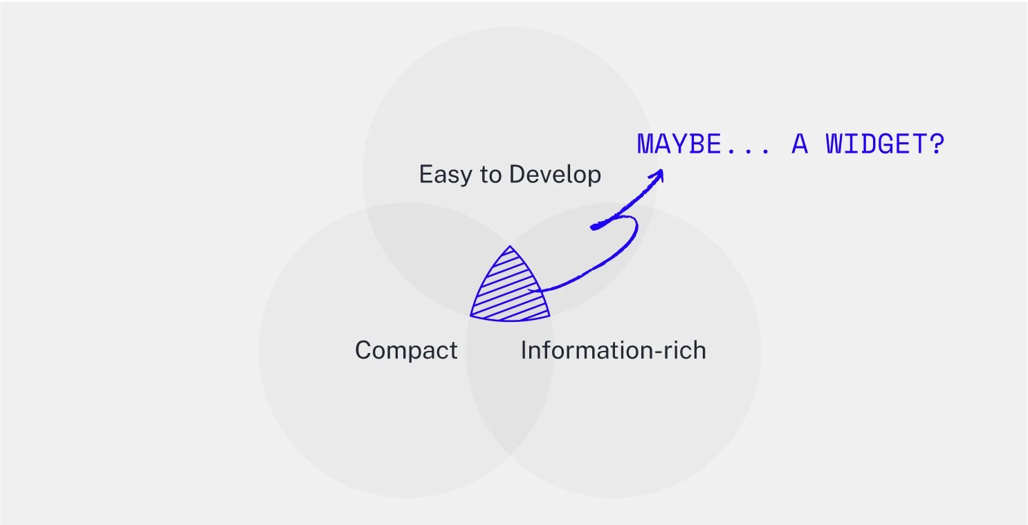
my approach
Then I explored different options based on the widget idea.
my approach
Then I explored different options based on the widget idea.
my approach
Then I explored different options based on the widget idea.
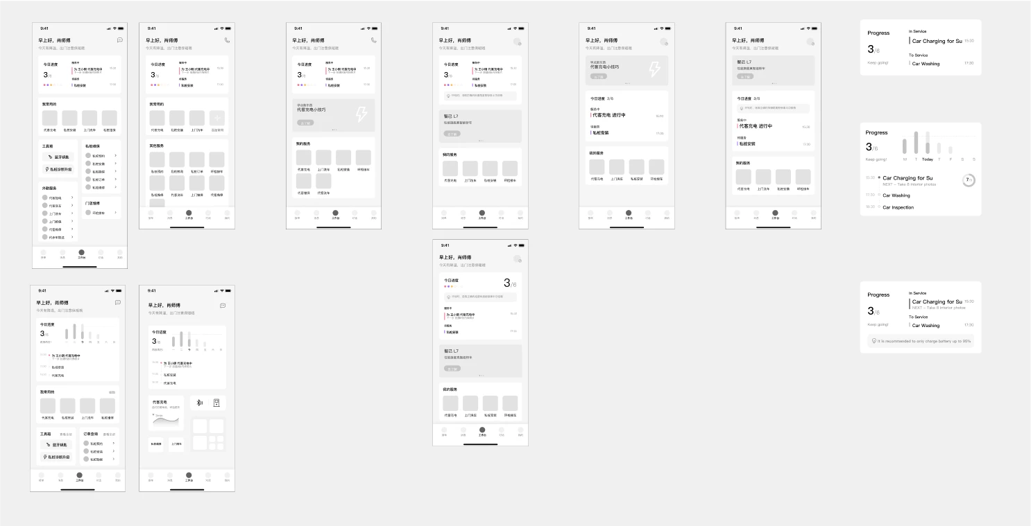
my approach
Finally, I presented the best 2 of them to all the stakeholders.
my approach
Finally, I presented the best 2 of them to all the stakeholders.
my approach
Finally, I presented the best 2 of them to all the stakeholders.
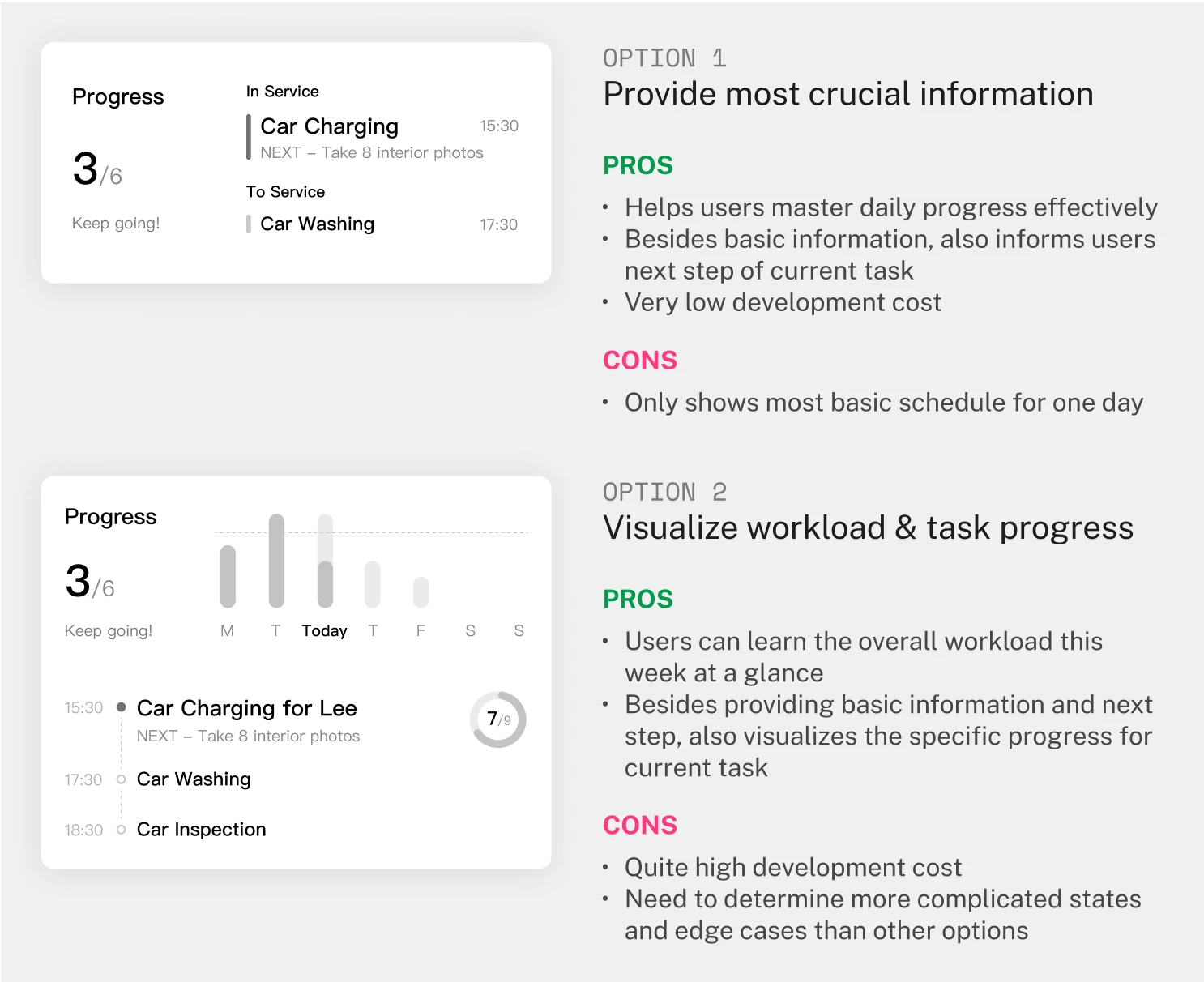
final design
After the sync meeting, we decided to go with option 1. Then I finalized it based on all the feedback.
final design
After the sync meeting, we decided to go with option 1. Then I finalized it based on all the feedback.
final design
After the sync meeting, we decided to go with option 1. Then I finalized it based on all the feedback.
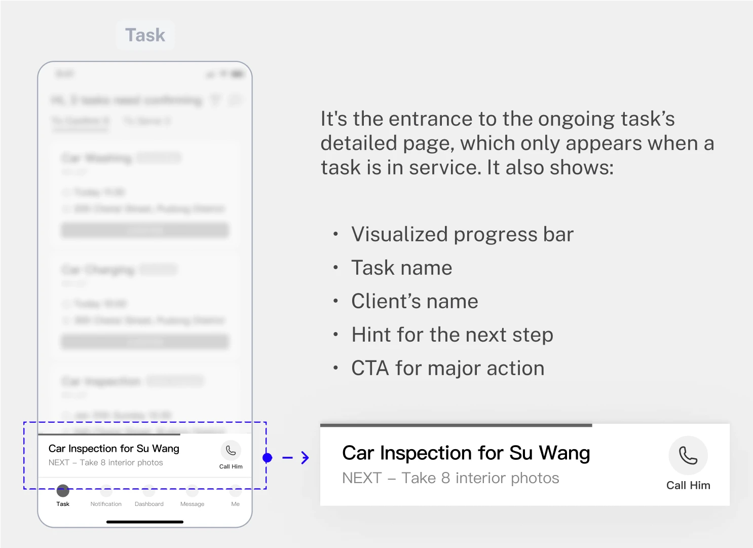
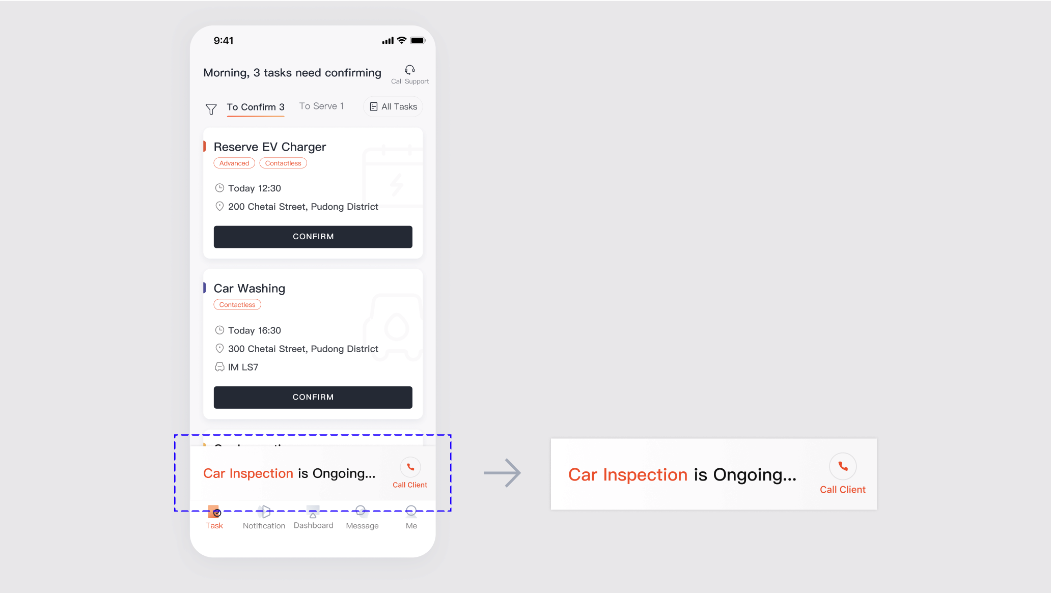
Design Development
Feature #2: Sticky Ongoing Task Bar
Initial feedback
It can only be shown on the TASK page.
Initial feedback
It can only be shown on the TASK page.
Initial feedback
It can only be shown on the TASK page.
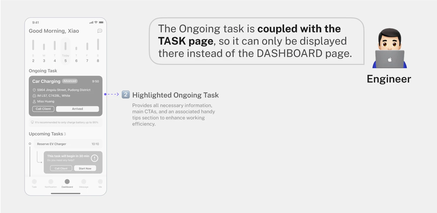
my approach
I first created an ideal concept on the TASK page as the starting point of discussion.
my approach
I first created an ideal concept on the TASK page as the starting point of discussion.
my approach
I first created an ideal concept on the TASK page as the starting point of discussion.
my approach
Then I synced with the client. Though I got pushback, I ran a rapid A/B testing to validate and defend my design.
my approach
Then I synced with the client. Though I got pushback, I ran a rapid A/B testing to validate and defend my design.
my approach
Then I synced with the client. Though I got pushback, I ran a rapid A/B testing to validate and defend my design.

my approach
Meanwhile, I also stepped back and proposed a downgraded version based on feedback.
my approach
Meanwhile, I also stepped back and proposed a downgraded version based on feedback.
my approach
Meanwhile, I also stepped back and proposed a downgraded version based on feedback.
final design
A downgraded sticky ongoing task bar that fulfills all requirements while can be scaled up in the future.
final design
A downgraded sticky ongoing task bar that fulfills all requirements while can be scaled up in the future.
final design
A downgraded sticky ongoing task bar that fulfills all requirements while can be scaled up in the future.
Design Development
Feature #3: Actionable Reminder
Initial feedback
Make it more noticeable and universal.
Initial feedback
Make it more noticeable and universal.
Initial feedback
Make it more noticeable and universal.
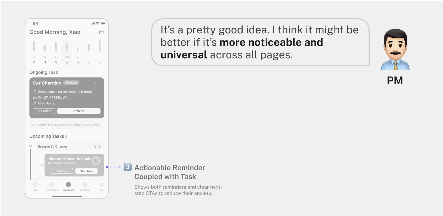
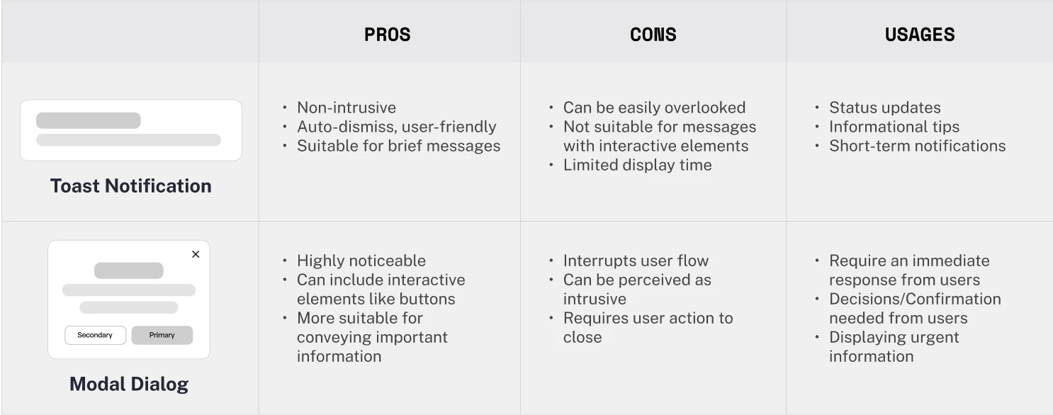
my approach
I researched common design systems to find the best practices for this scenario and compared them.
my approach
I researched common design systems to find the best practices for this scenario and compared them.
my approach
I researched common design systems to find the best practices for this scenario and compared them.
my approach
I also discussed with the dev team to see which one they recommend the most.
my approach
I also discussed with the dev team to see which one they recommend the most.
my approach
I also discussed with the dev team to see which one they recommend the most.
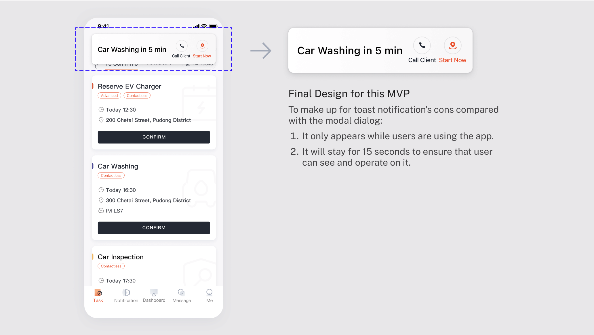
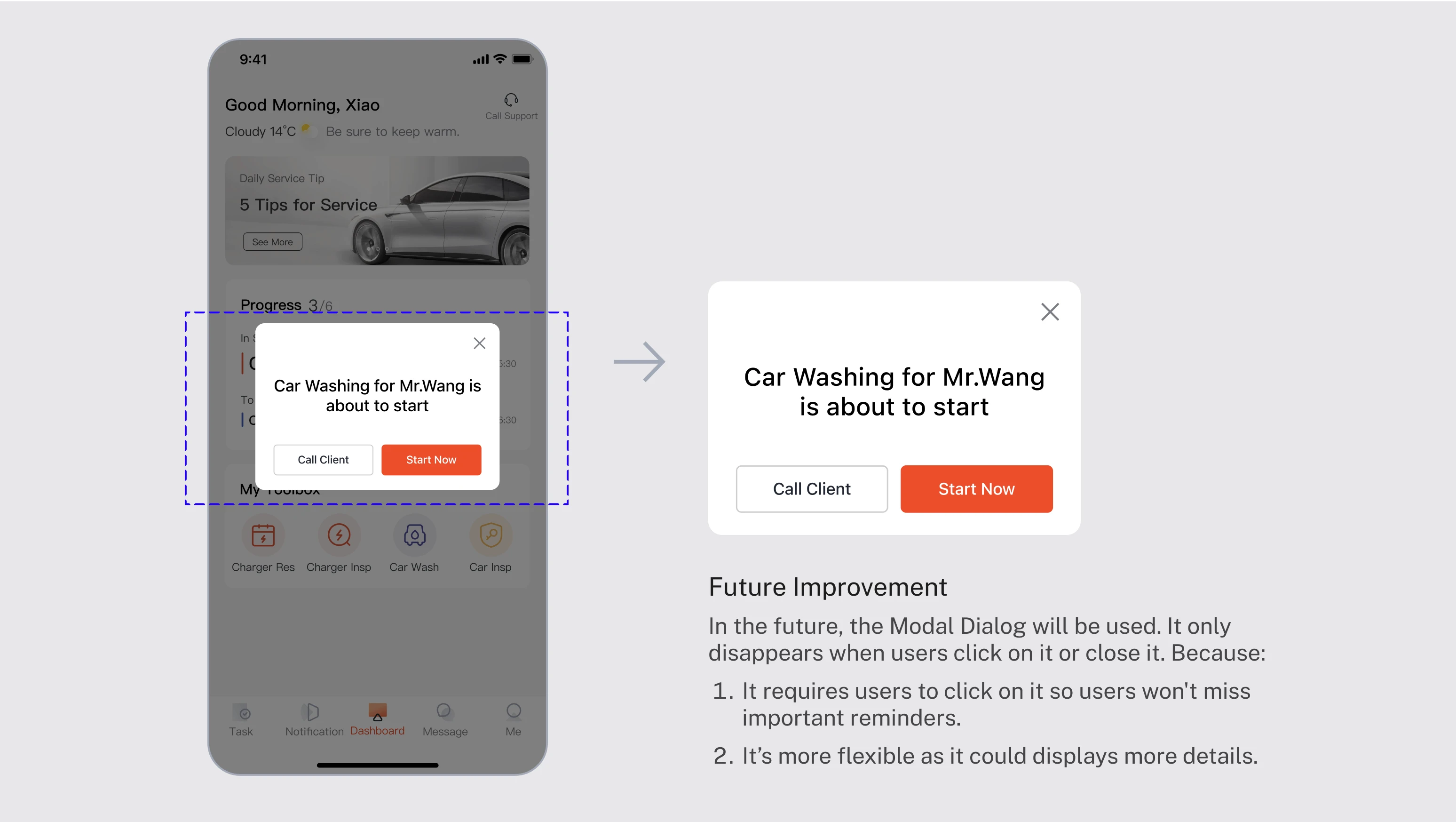
final design
Finally, I used the toast for this MVP, adding rules to better suit the usage scenario. Also, I persuaded the dev team to add the Modal Dialog to their design systems in the future.
final design
Finally, I used the toast for this MVP, adding rules to better suit the usage scenario. Also, I persuaded the dev team to add the Modal Dialog to their design systems in the future.
final design
Finally, I used the toast for this MVP, adding rules to better suit the usage scenario. Also, I persuaded the dev team to add the Modal Dialog to their design systems in the future.
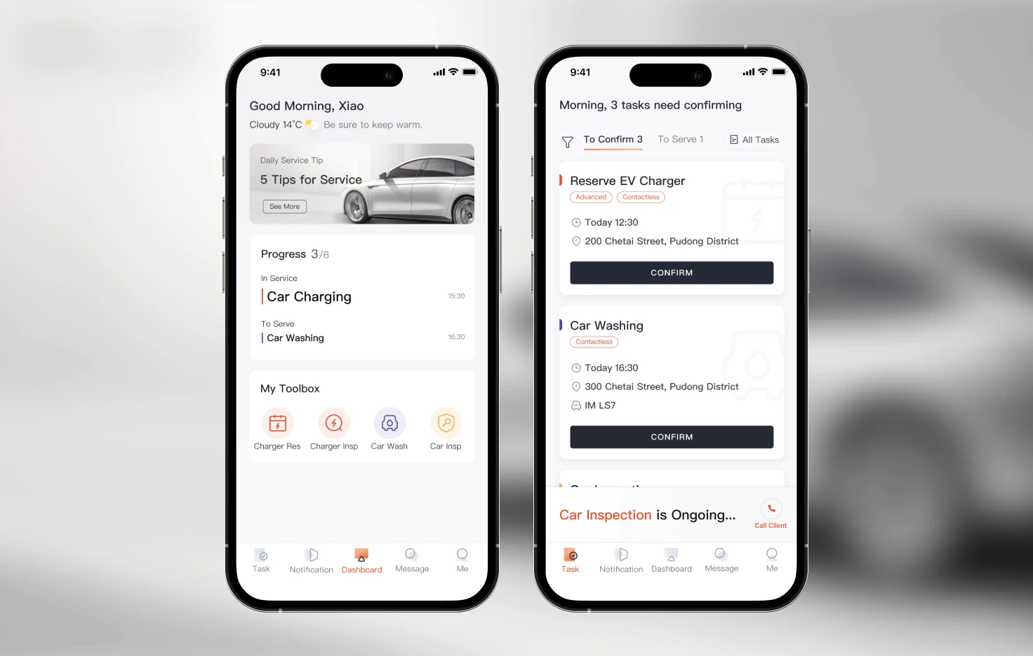
Final Redesigned Features

Final Outcome
14.8%
14.8%
14.8%
The average task completion time for all flows was reduced by 14.8%
26.3%
26.3%
26.3%
Overall user satisfaction among mechanics rose by 26.3%
“The design really exceeds what we expected, especially considering the tight timeline and limited resources.”
From UX Department Lead, IM Motors
Takeaways
Takeaway #1
🌊 Turn Challenges into Opportunities
UX design is not a smooth process. Every twist – be it pushback, evolving scopes, or compressed timelines – is a chance to grow. Through this project, I learned how to expect the unexpected and adapt swiftly.
Takeaway #1
🌊 Turn Challenges into Opportunities
UX design is not a smooth process. Every twist – be it pushback, evolving scopes, or compressed timelines – is a chance to grow. Through this project, I learned how to expect the unexpected and adapt swiftly.
Takeaway #1
🌊 Turn Challenges into Opportunities
UX design is not a smooth process. Every twist – be it pushback, evolving scopes, or compressed timelines – is a chance to grow. Through this project, I learned how to expect the unexpected and adapt swiftly.
Takeaway #2
🧭 Prioritize Scalability in Design
As a designer, it's important to remember that I'm not only designing for now but also for the future. This project taught me to think long-term, considering the broader impact and future growth potential of every design decision.
Takeaway #2
🧭 Prioritize Scalability in Design
As a designer, it's important to remember that I'm not only designing for now but also for the future. This project taught me to think long-term, considering the broader impact and future growth potential of every design decision.
Takeaway #2
🧭 Prioritize Scalability in Design
As a designer, it's important to remember that I'm not only designing for now but also for the future. This project taught me to think long-term, considering the broader impact and future growth potential of every design decision.
Takeaway #3
💡 Rationales are Backbone of Design
At first, it was scary to present in front of all stakeholders for me as a junior designer. However, I gradually became more confident since I knew that I always had strong rationales behind every decision. It helped me to defend my designs and created more constructive communication.